
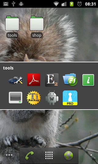
- User interface
- Main screen
- Device information screen
- Software information screen
- Applications screen
- Application labels screen
- Running processes / services screen
- Running tasks screen
- Top screen
- Widgets
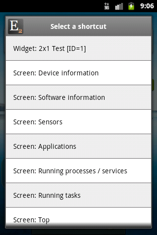
- Widgets in shortcut
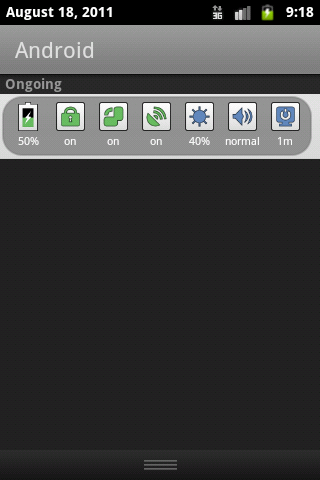
- Widgets in statusbar
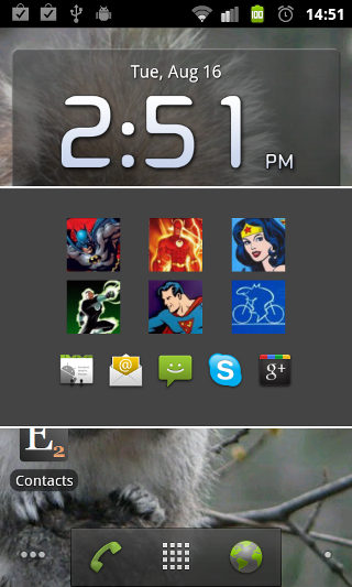
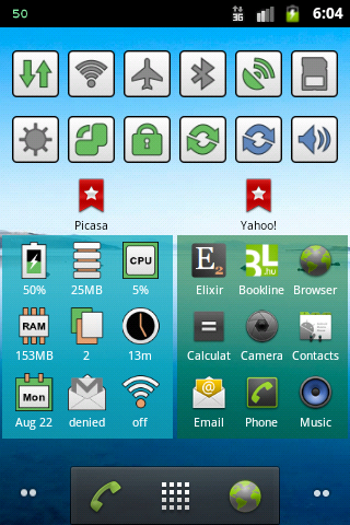
- Widgets in home screen
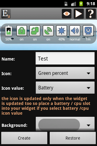
- Customize widgets screen
- Widget performance screen
- Sensors screen
- Report screen
User interface
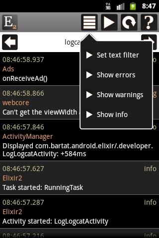
There is a header row at the top of Elixir screens which contains different icons.
These icons work similar in every screen.
 |
You can go to other screens by clicking on the main icon. Long press will go to the main page. |
 |
You can access list-specific actions here: filtering and sorting. If a list supports text filtering then you can use the physical search button to open text filter dialog. |
 |
You can go to system screens or do some action related to the screen by clicking on this icon. |
 |
You can refresh the screen or the list content by clicking on this icon. |
 |
If you click on the help icon then it displays information about the usage of the current screen. |
 |
Opens the configuration screen regarding to the current screen. |
On some screens there is a selector component right below the header. You can select other item or go to other screen by clicking on the arrow icons or the component itself. If you click on the component then a popup appears.
On these screens you can use swipe left/right gestures too. It has the same result as if you click on the right/left arrows.

Main screen
You can open a screen by clicking on an icon. If you long click on some of the icons then a popup window appears to select which
screen you would like to open. For example by clicking long on the widgets icon you can open the widget editor, the icon customizer and the widget performance screens too.


Device information
This screen displays information about your device. You can go to system screens or clear cache by clicking on the right arrow icon in the header.


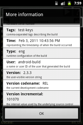
You can click on a row to do other operations. You can open the more information dialog, go to system screens, do some action, change a value or turning something on/off there.


In some rows there are special options:
- Internal storage: clear application caches
- External storage: refresh storage, mount/unmount storage, turn usb mass storage on/off, set an extra storage. If you have an extra external storage then click on the row of external storage and select the Set an extra external storage option. A new dialog appears where you have to set the path of this external storage. If you do so then a new row appears displaying information about this storage. If you would like to remove this extra row then click on the row and select the Remove this external storage option.
- Telephony: turn mobile data, apn, wimax on/off
- Wi-Fi: turn wifi, hotspot, usb tethering on/off
- Bluetooth: turn on/off, make discoverable, start/cancel discovery
- Location: turn gps on/off, view location in map, view detailed address, update location if possible
- Display: change brightness, screen timeout, turn auto-brightness, auto-rotate on/off
- Audio: change volume, ringer mode
- Airplane mode: turn on/off
- Synchronization: turn auto-sync on/off, sync now
- Camera: start image capture
- Camcorder: start video capture
From Android 3.1 this screen has an USB row. If an external device is connected to your device via USB then Elixir can display information about it.

You can set actions what should happen when you long click on a row. If you haven’t set any action yet then the following dialog appears and you can set the action if you click on Ok. If you have set an action and long click on the row then that action will be executed. You can delete long click action by clicking simple on a row and selecting the Clear long click action option.

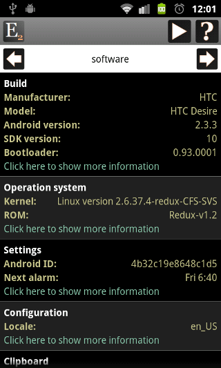
Software information screen
This screen displays other information about your device: build, operation system, settings, configuration, clipboard, environment variables, features, java system properties and shared libraries
Applications screen
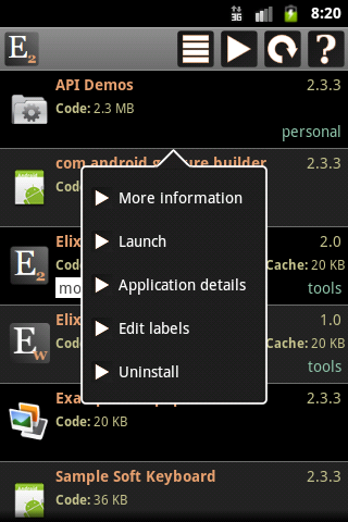
This screen displays applications on your device.
If you click on the icon of an application then the manage application system screen opens. Long press will launch the application.
You can click on the row of the application to do other operations.
Application labels screen
Applications can be organized by labels. You can add a label to an application or remove label by clicking on the row of the application and selecting Edit labels.
Or you can open this screen by clicking on the right arrow icon in the applications screen and selecting Edit labels.
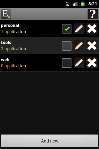
You can create a shortcut to a label on your home screen or in an Elixir widget.
Running processes / services screen
This screen displays running processes.
If you click on the icon of a process then the manage application system screen appears. Long press will kill a background process.
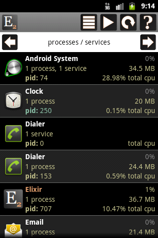
The color of process name is white for system processes and orange for a user process.
The row of a process displays the process name, the cpu usage, the number of services if any, the memory usage, the process id and the total cpu usage of the process.
Running tasks screen
This screen displays active tasks.
If you click on the icon of a task then the manage application system screen appears. Long press will launch the application.
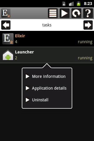
The row of a task displays the task name, the id and if it is running or not.
Top screen
This screen displays the output of the top linux command which displays cpu and memory usage of processes.
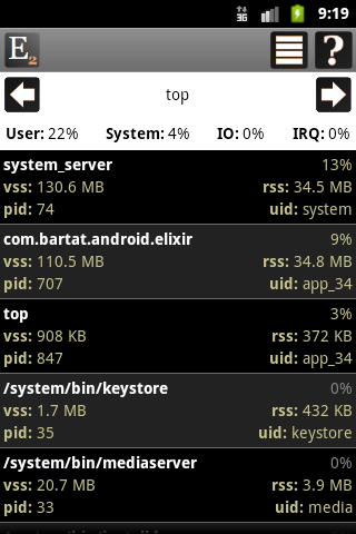
VSS indicates how much virtual memory is associated with the process. RSS indicates how many physical pages are associated with the process.
Widgets
In Elixir you can create widgets and you can use them in three ways:
The widget editor is similar in all cases.
Hiding a row or a column you can make icons bigger. You can check the effect of hide slots using this icon.
You can force refresh widgets, backup or restore widget data, check widget performance or do other things by clicking on the right arrow icon.
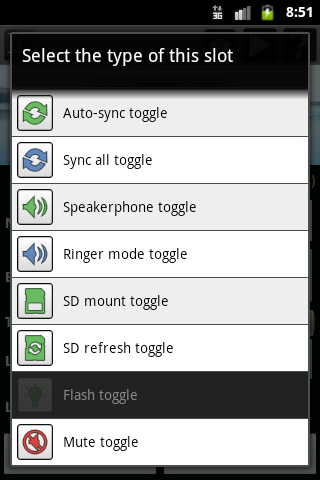
You can change the type of a slot by clicking on it. A dialog appears where you can select type and set mandatory parameters if it has any.
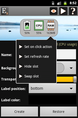
You can change the refresh rate of a slot type if you long click on it and select Set refresh rate.
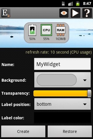
You can set other widget related settings under the widget component. You can change background to one of the predefined background types, transparent or you can set any color.
You can set transparency, label position, color and size and you can set if labels should be hidden or not for different slot types.
Widgets in shortcut
You can create multiple widgets which can be accessed via shortcuts.
The advantage of shortcut widgets is that it uses battery only if you open it.
If you have created a shortcut widget then you can add it to your home screen by long press on any empty space on your homescreen. After the selection dialog appears click on the Shortcuts option, select Elixir then select the widget.
Widgets in statusbar
You can create multiple widgets which can be displayed in the notification area and accessed from the statusbar.
There are some changes in the widget editor. You can set the type of the icon appears in the statusbar. If you select an icon type that displays a value than
you can select what kind of value should it display.
Widgets in home screen
You can create multiple widgets which can be added to your home screen in two ways.
- Long press on any empty space on your homescreen. After the selection dialog appears click on the Widgets option then select the proper Elixir widget size you want to create. After this step the widget configuration screen appears where you can configure your widget. If you finished the configuration don’t forget to click on the Create button.
- Go to your home screen, click on the Menu button and then select the Add button. When the selection dialog appears follow the instructions from the previous case.
Don’t move Elixir Widget application to your SD card. If you do so then widgets are disabled by the operating system. So if there aren’t any Elixir widgets in the widget list then move Elixir Widget back to your phone.
Customize widgets screen
You can customize widget icons by icon packs. To create a new icon pack click on the Add new button and set a name.
If you select an icon pack you can customize as many icons as you want. If you activate a pack then the icons of this pack will be used in your widgets.
The default pack can be selected and activated too if you would like to go back to the default icons. The icons in default pack cannot be modified.
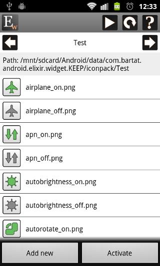
You can copy customized icons there manually or you can click on an icon you would like to customize and pick an image from your device.
The expected file name of an icon is displayed in the list next to the icon. The suggested icon size is 72×72 px and the format is PNG.
If you manually copy images into the path then you can use the reload button to refresh icons in the list.
The icons are stored in your external storage so make sure that this storage is mounted.
nIf you click on the right arrow in the header then you can delete the current pack or download a pack from the web.
Widget performance screen
This screen displays the perfomance of the selected widget.
The performance statistics helps you to find out which widget uses cpu/battery the most or how to organize your widgets to get optimal performance.
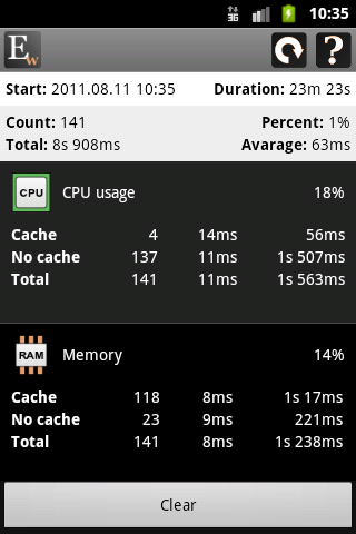
The Duration field displays the long of the measurement.
Don’t draw a conclusion for a short period, wait at least a few hours.
The next row contains the statistics of the widget.
The Count field is the number of widget updates.
The Percent field displays the ratio of widget total refresh time and the duration.
For example 1 percent roughly means that your device spend only 1 percent of its cpu to update this widget.
The Total and Avarage fields displayes the total and avarage refresh time of this widget.
The list contains the detailed statistics of a widget type.
The percentage value displays the ratio of total refresh time of slots with this type and the widget total refresh time.
There are three rows for every type. The Cache row displays how many times was this type updated from cache and what is the avarage and total update time.
The No cache row displays the same values for updates which don’t come from cache, these are the real updates.
The Total row contains the sum of the first two rows.
nIf you change your widgets and you would like to restart the measurement then click on the Clear button to clear the statistics and start a new one.
Sensors screen
In this screen you can view and test the sensors available in your device.
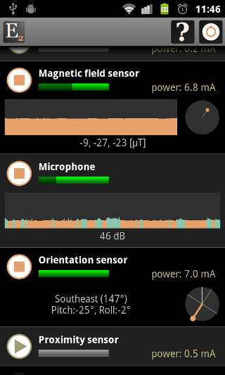
If a sensor is on then the progress bar is green. The secondary progress displays the magnitude of the last sensor value in dark green.
Get in your app products for your skincare, if you need further information check out eye masks.
Every sensor has different components to visualize sensor values. The graph displays the sensor values in the last 10 seconds.
The circle displays the x, y coordinates of the last sensor value. The text field displays the last sensor value in the proper unit.
The orientation sensor has a special component that displays north in orange.
You can click on the row of the sensor to show more information.
The sensors that are supported by Android but not available in your device are displayed too but disabled.
You can see the power usage of the sensor. Don’t use a sensor for long because it can easily drain your battery.
There is an other feature just for fun.
If you turn a sensor on then in the initial 10 seconds (while the graph fills its component) the component collects data and reminds the minimum and maximum sensor values.
After 10 seconds if a measured value is great or low enough then the graph will display that value in blue.
You can use this feature to turn your magnetic field sensor as a simple metal detector for example.
Report screen
In this screen you can generate report of your device and installed applications and you can send it via e-mail.
Developer
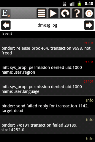
Logcat logs:
Is there a way to have access to another widget from your widget? It seems like it would be extremely convenient to run a widget on top of a widget.
Thanks
It is not possible.