Elixir 2.19 is available

What is new

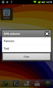
  • New APN selector toggle to select APN settings in widgets or profiles
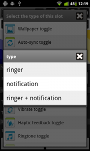
  • New Vibrate toggle to change ringer and/or notification vibrate setting
  • New Haptic feedback toggle (vibrate on touch in ics)
  • Mobile network toggle: can display network type or signal strength as label
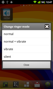
  • Ringer mode toggle: can open dialog with new normal, normal+vibrate, vibrate and silent options
  • Device info screen: invert storage and memory progress bars to show used space
  • 4×5 widget size
  • Other small changes, bugfixes (apn toggle in profiles)

APN selector toggle

This new toggle displays the name of the selected apn setting as label and opens a dialog if you click on it to select the preferred apn setting:

Using this toggle in a widget is not so interesting but it is useful to use in profiles and activate different apn settings for different profiles.

Vibrate toggle

When you add the new vibrate toggle to a widget or profile you can set if you would to change vibrate mode of ringer, notification or both. The toggle has three states and you can change between them by tapping on the toggle: on, off or only in vibrate mode.

Haptic feedback toggle

This toggle can be used in widgets and profiles and you can toggle it directly from the audio row of device information screen. This setting is called as Vibrate on touch on ICS devices.

This toggle is available only if your device has vibrator.

Change ringer and vibrate mode together using a dialog

On the widget editor screen if you long click on the ringer mode toggle then there is a new Set open dialog option. If you enable it then a dialog opens if you click on the toggle where you can set ringer and vibrate mode together:

The normal option turns ringer mode to normal and vibrate mode off. The normal + vibrate option turns ringer mode to normal and vibrate mode on. So with these two options you can determine if you would like your device to vibrate or not if you have a call.

Invert storage progress bars on device information screen

By default progress bars on device information screen displays the percent of available resources. If you would like the storage rows to display the percent of used space then you can click on the internal storage, external storage and memory rows to Invert progress bar:

Elixir 2.18 is available

What is new

  • Elixir 2 – Donation Key app is available on Google Play to remove ads, etc.
  • Bookmarks: permission is moved to personal add-on, fixes
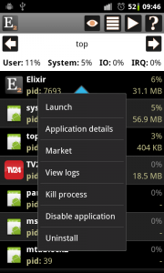
  • Top screen: new compact view; item actions: launch, details, market, view logs, kill, uninstall
  • Applications screen: enabled/disable applications for rooted devices
  • New popup design with categorized items
  • Device info/Processor/More information can display number of processors
  • Other small changes, bugfixes (help screen)

Elixir 2 – Donation Key

You can support development by buying this application on Google Play.

If you do so then ads will be removed and donators-only features will be enabled too.

Bookmarks

Now Personal add-on is needed to use Bookmarks, history widget because the permission needed for this feature is moved to the personal add-on. This change was mandatory because there are users who don’t want to allow this permission but would like to use Elixir 2.

Top screen

The top screen has a new Compact view to be able to display more processes on the screen. If you click on the eye icon you can select the previous List view too.

If you click on an item you can do different actions with the selected process:

Enable/Disable applications

The applications screen can now display if an application is disabled or not. If you click on the list icon in the header you can filter disabled applications too.

There is a new Enabled/Disable application option when you click on an application. This feature is available only for rooted devices:

You can disable an application from the top screen too.

New popup design

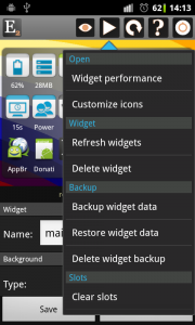
Popup design changed and now popup items are categorized:

Elixir 2.17 is available

What is new

  • New widget: bookmarks, history
  • Flash toggle: can display a white screen with max brightness
  • Bluetooth toggles: open state-chooser dialog
  • Widget customization: change label color; custom colors for on/off/unread/missed states (donators only)
  • Better widget performance
  • System add-on: mobile data toggle
  • Other small changes, bugfixes (screen toggle fix for ics)

Bookmarks, history

A new Bookmarks, history icon can be used in widgets to display browser bookmarks and history in a dialog:

In the dialog you can see the bookmarks in white and history items in blue. By default these items are sorted by number of visits but you can sort by name and last visited time too. If you click on an item then browser opens to display the selected url. If you have more then one browser installed you can long click to select the browser you would like to use to open the link:

Flash toggle

From this version of Elixir if you don’t have TeslaLED installed then flash toggle opens an empty, white screen with maximum brightness that can be used as a flashlight even on devices without a flash. If you have TeslaLED installed you can use this new screen too, you can set on the widget editor screen if you would like to use the flash and/or the white screen. Just click long on the flash toggle icon and you can select one of the use flash and use screen options to change these values. You can close the white screen by clicking anywhere on the screen.

Change bluetooth state dialog

If you click long on the bluetooth toggle icon on the widget editor screen you can select the Set open dialog option to set the toggle to open the new dialog instead of changing the bluetooth state:

Widget label colors (donators only)

It is possible to set label color for every icon of the widget. You should open the widget editor, click long on an icon and select the Set label color to modify the color of the label. After you set the color you can use the default color again by selecting the Clear label color option. For an on/off toggle you can set different colors for the on/off states by selecting the Set label color – on/off options. The similar methods can be used to set notification color for unread email count, unread messages count and missed calls widgets:

On the following screenshot you can see how you can use this new feature:

  • the first widget uses different label colors for on and off states of toggles
  • the second widget uses different label colors to look well on this colorful background
  • the third widget uses different colors for every icons and uses red color for email notification

If you open the color dialog then the previously used color will be set as default color. So you can easily set the same color for multiple icons. For example if you would like to set gray color for off states and green color for on states then set gray for one toggle and after it set grey for other toggles before you set the green colors. If you do so then you can click on Ok right after the color dialog appears because it will display the same color used before.